The Anatomy of a Brand: Blackbird Fine Art Photography
March 24, 2022
Once Upon A Time …
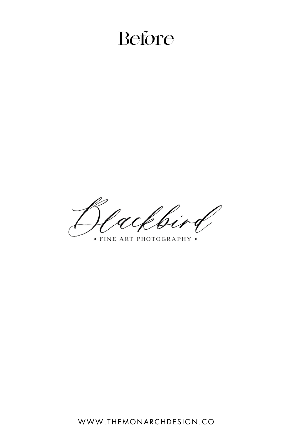
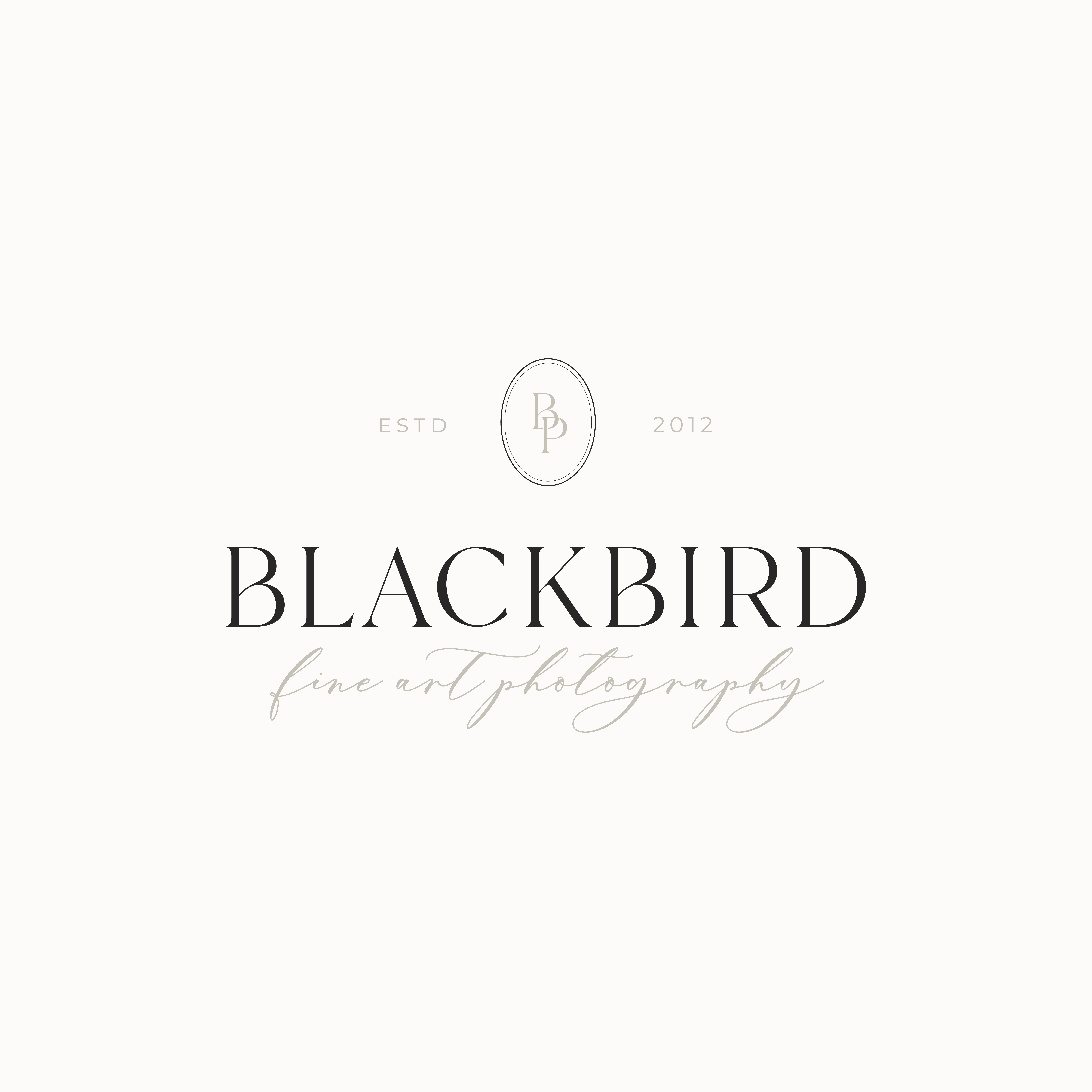
Melissa from Blackbird Fine Art Photography was working in the industry for over 10 years capturing moments and the love between families and couples. As she reflected on how she wanted to grow, she knew she wanted to venture into the higher-end wedding market. To achieve this, revamping her brand was exactly what she needed to showcase the quality of her work. That’s where we came in ✨. As a Southern Ontario-based wedding and family photographer Melissa specializes in heirloom imagery that withstands generations. Therefore, my intention going into this branding project was to create a brand that captured the timelessness of her work. Today, I’m delving into the process behind creating this lovely wedding photographer’s branding. This project was such a dream to work on, so come along!
The Brand Anatomy: Wedding Photographer Branding That Tells a Story
The Palette
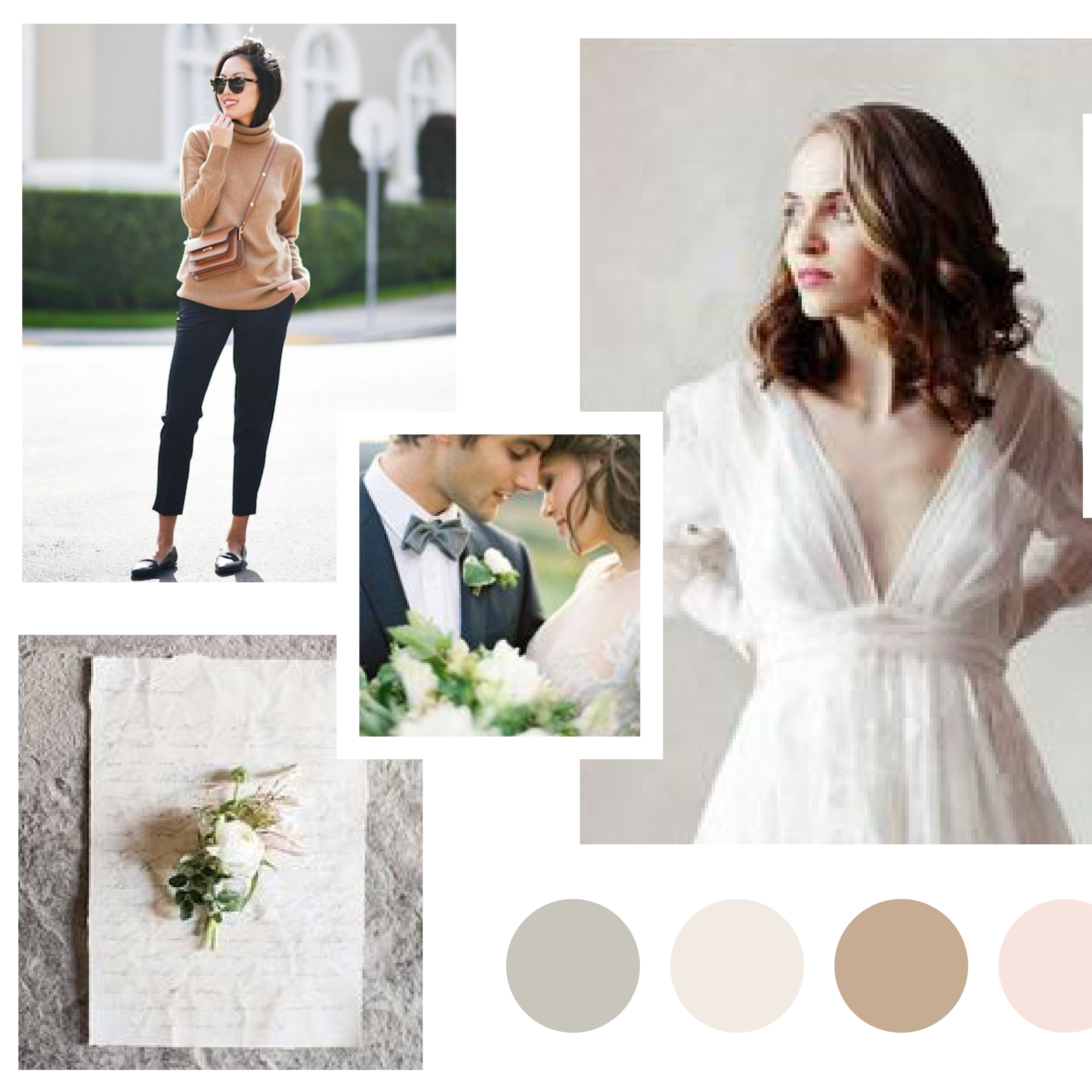
Melissa describes herself as a gentle-natured friend of her clients: someone that you meet and instantly feel at home with. For this reason, her colour palette reflects the ethos of Blackbird Photography: warm, inviting, elegant, gentle and romantic.
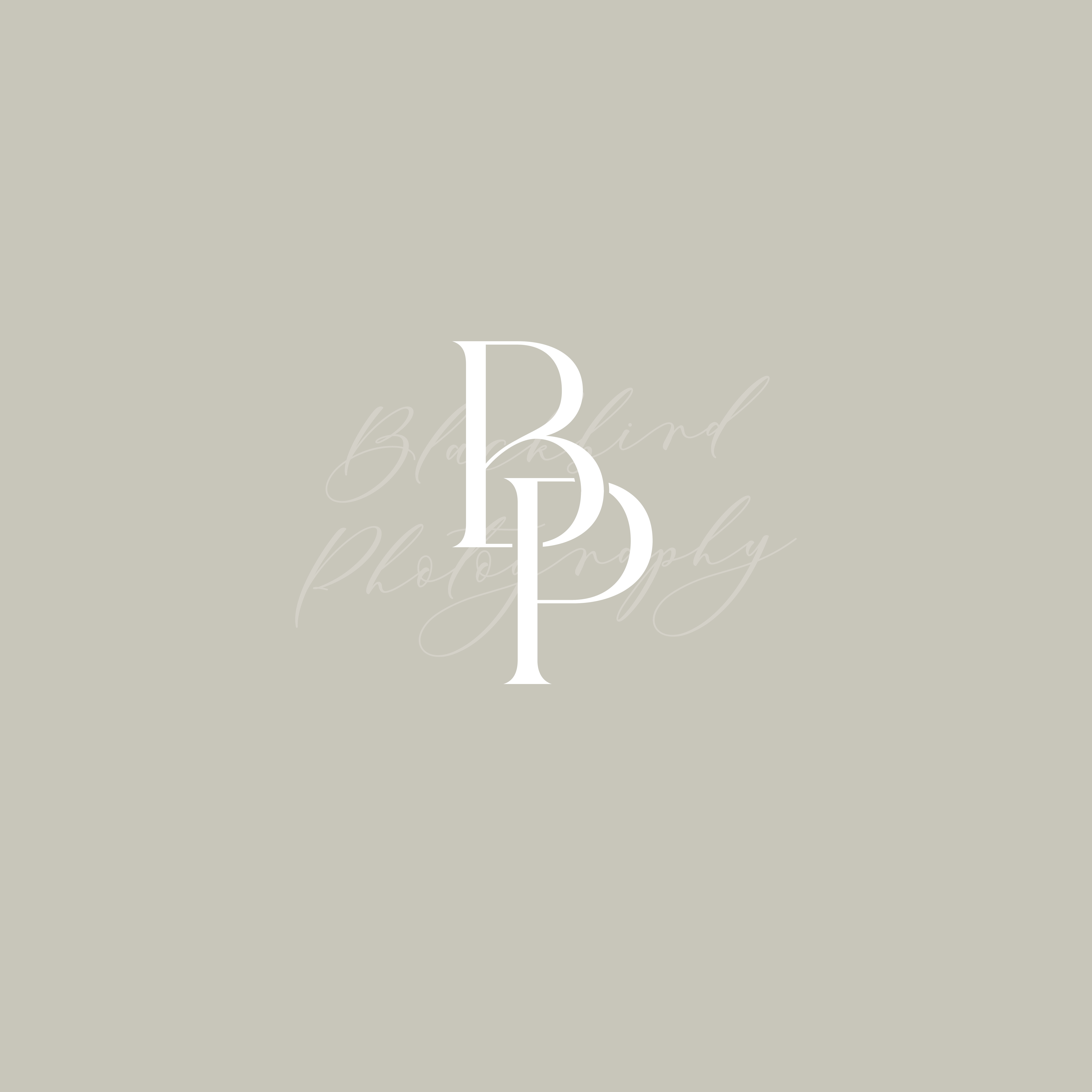
In order to represent the timeless, romantic nature of Melissa’s work, I curated a colour palette of soft, earthy tones. This mix of sage, creams, taupe and rose evokes the same sense of calm you feel when working with Melissa, which gives her clients a sense of the kind of work they can expect from Blackbird.
The Fonts
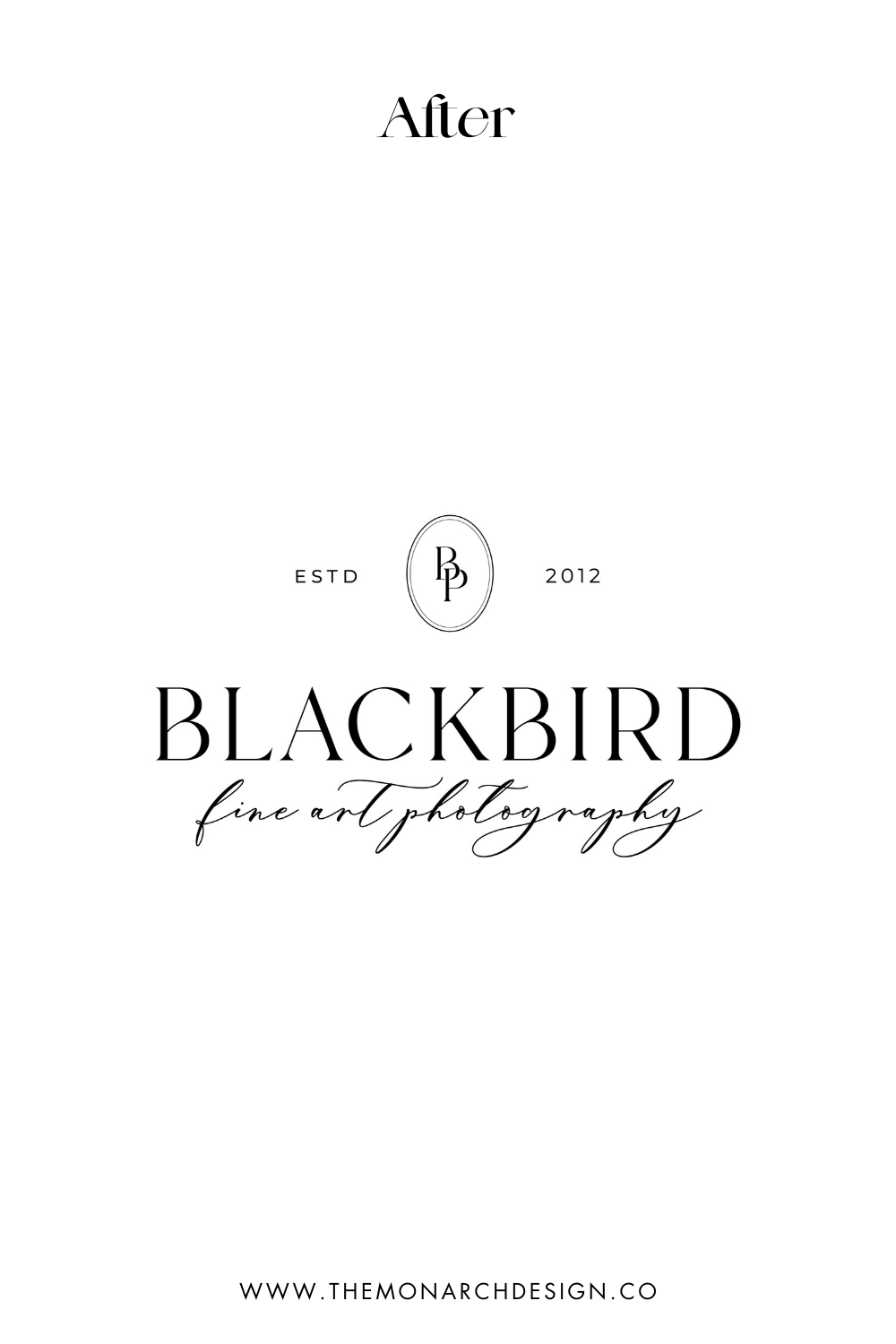
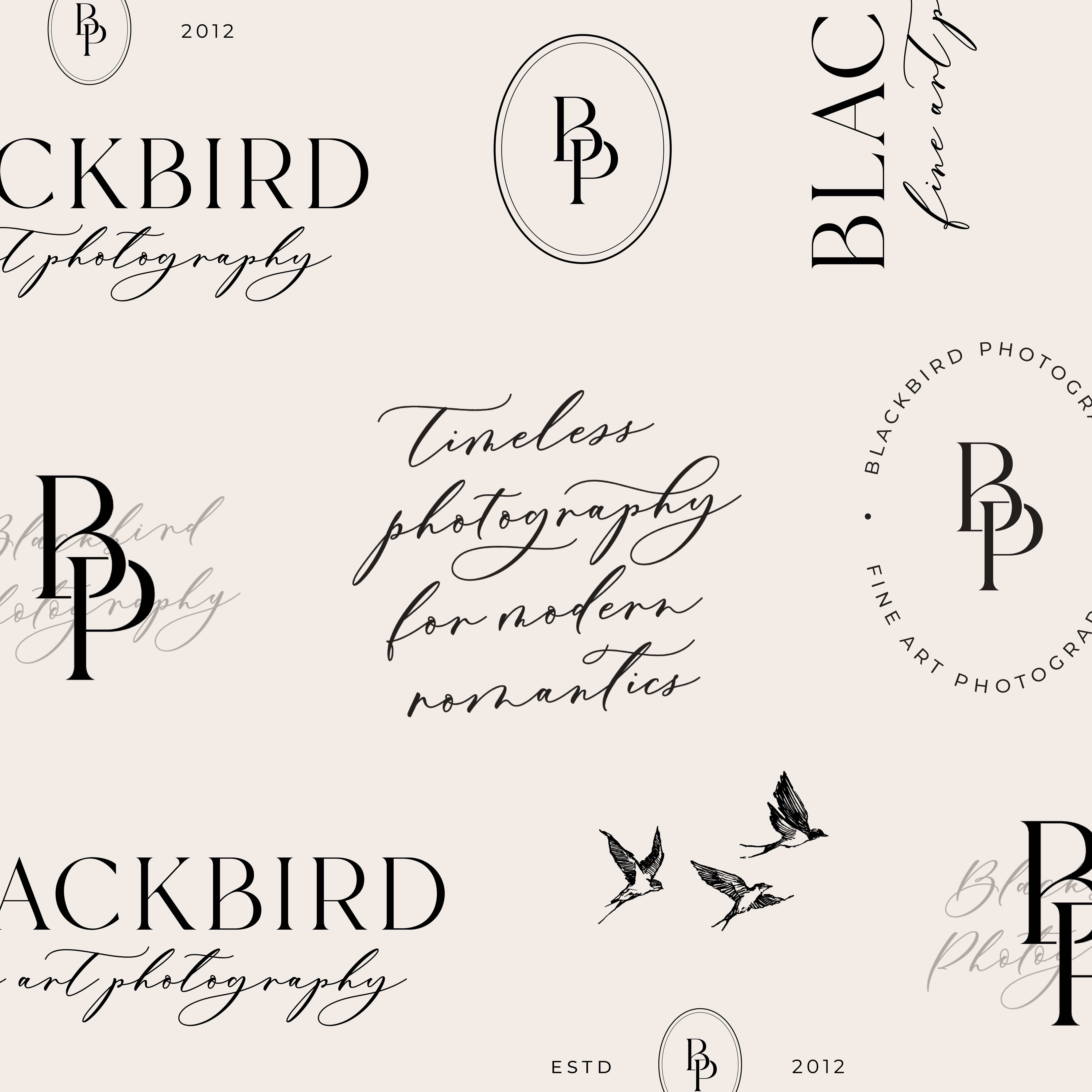
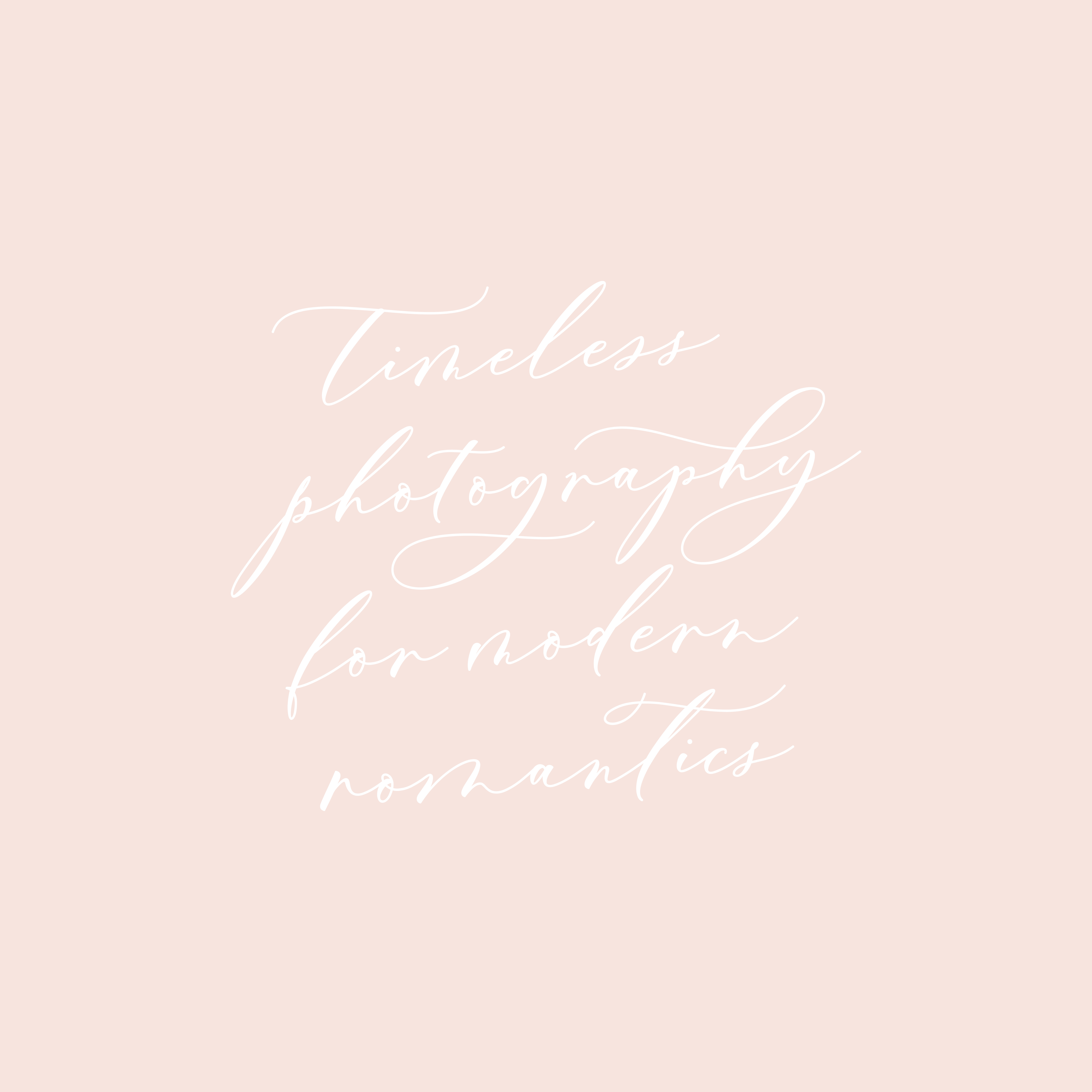
With a palette filled with warmth and romance, I began the process of choosing the perfect fonts for this wedding photographer’s branding. To start, I built Blackbird’s font package around this beautiful calligraphy that has a hand-drawn feel. The modern calligraphy represents a sense of thoughtfulness and gives a personalized feel, which is what Melissa is all about.
To allow the calligraphy to shine, I paired it with a simple sans serif that appeals to Melissa’s target audience of modern romantics. I finished it off with a delicate serif that channels the classic feel that is a staple to Blackbird’s imagery!
The Magic in the Details
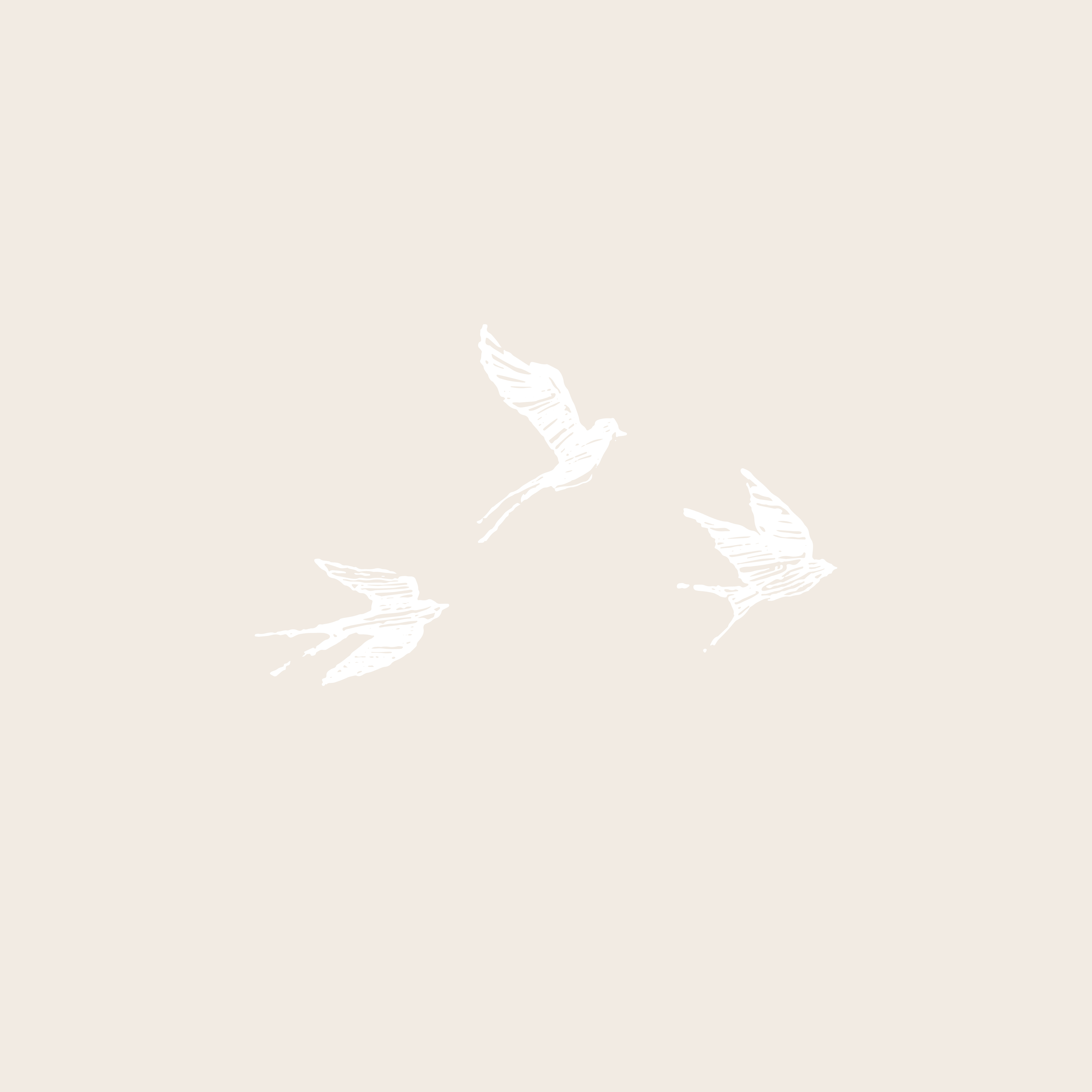
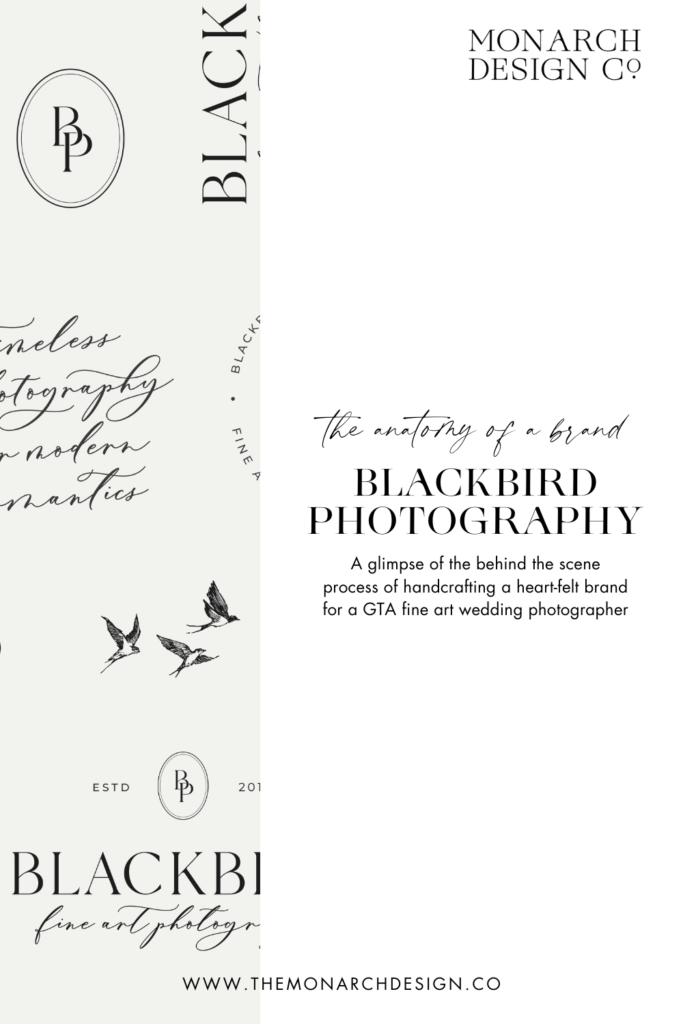
With the basics covered, the magic lies in the details 💫. This is where the whole brand comes together: adding a unique element that is memorable and tells a story. To draw on Blackbird’s namesake, I sketched out a delicate flock of birds to channel lightness, freedom and romance. You can feel this imagery in Melissa’s beautiful images, so it was the perfect detail to tie the brand together!
In addition to these whimsical birds, I wanted to draw on the heirloom feel of Melissa’s wedding photography. Blackbird creates thoughtful imagery that withstands time, so I completed her branding with a delicate oval for an heirloom feel. To me, the look is similar to a treasured locket that is passed down throughout generations.
When I’m working on a branding project, I’m all about telling the story of the brand by crafting a visual narrative that represents the heart and soul of your biz and invites your dream clients to be a part of it.
And This Wedding Photographer (and Her Branding) Lived Happily Ever After.
From a soft, romantic colour palette, to thoughtfully-paired fonts and heirloom details, that was my process behind creating this wedding photographer’s branding! With a visual story that represents who Melissa is and where she’s going, Blackbird’s refreshed brand is designed to give her dream clients a sense of the work they can expect and create memorable impressions around her wedding photography biz.
Creating wedding photographer branding is all about representing what makes your work unique, so I can’t wait to see how Melissa continues to grow her beautiful business and creates cherished memories for modern romantics!
________________________________________________________
At Monarch Design Co., we help small businesses like Blackbird Fine Art Photography take flight with branding that tells your story. As a boutique branding studio, we create brands that reflect the heart and soul of your biz so you can find your wings. If you’re inspired by this branding refresh, apply to work with us here!
Save for later with Pinterest!
Leave a Reply Cancel reply
Menu
serving simcoe county, barrie, the greater toronto area & worldwide
Contact
hello@themonarchdesign.co
Branding & Showit Web Design Studio | Serving Creative Entrepreneurs, Service Providers & Wedding Professionals in Barrie, Toronto, Niagara, Muskoka, Cambridge, Kitchener, Guelph, Hamilton, Burlington, Oakville, Mississauga, Vaughan, Simcoe County & Southern Ontario.
Monarch Design Co. © 2026 | Site & Branding Designed by Monarch Design Co. | Site Credits