The Anatomy of a Brand: The Memory Vine
February 24, 2022
The Memory Vine is a GTA-based wedding planning service creating everlasting memories that celebrate couples’ love stories. Founder Paula Holt understands the significance of saying “I do” through and through, and as such, she provides wedding packages that are unique to you and your partner down to every little detail. Bringing your vision to life with artistry, attention to detail and a touch of romance, The Memory Vine’s events celebrate couples’ journey as they enter into their next chapter hand-in-hand. Let’s take a look at the Anatomy of the brand.
As Paula continues to grow and evolve her wedding planning business, she reached out to Monarch Design Co. to create a brand that matches the magic she creates ✨I’m so excited to share how this branding project turned out, so today I’m breaking down the design process from the colour palette to typography and the little details that make all the difference!
The Story
When creating a custom brand, my process is rooted in storytelling. To begin the design process, I sat down with Paula to do a little soul-searching into the heart of her business: the values that drive her, the goals that get her up in the morning, the dreams she has to grow her business and the clients she hopes to work with as she continues to evolve.
Through this heart-to-heart, I discovered that what Paula truly needed was a brand that speaks to the elegant, timeless and romantic feel she cultivates through her events. Branding is the key to captivating the clients you dream of working with, so my intention in designing this brand was to create a visual story that reflects Paula’s events and inspires lasting memories around her biz.

The Brand Anatomy
Crafting a Colour Palette
As one of the pillars of creating a the anatomy of storytelling-driven brand that evokes emotion, I began with crafting a warm, romantic, down to earth colour palette. In the world of branding and marketing, colour psychology explores how colour impacts potential consumers’ impressions of a brand. Colour has the power to persuade people to work with you, so your colour palette is essential to attracting your dream clients and evoking an emotional response.
When crafting The Memory Vine’s colour palette, I brought in a complementary mix of brown tones, green, soft pink, a dark navy and off-white to achieve balance and an inviting, romantic feel. While the soft pink channels the love and compassion that speaks to love in the air at Paula’s events, the brown and navy tones ground her brand with feelings of trust, healing and comfort, all of which are important to Paula as she fosters relationships with the clients she works with. Adding in a green to tell the story of new beginnings, harmony and growth associated with marriage and bookmarking the colour palette with a neutral white to represent the lightness and angelic feel of Paula’s events, these colours work together seamlessly to tell The Memory Vine’s story.
The Typography
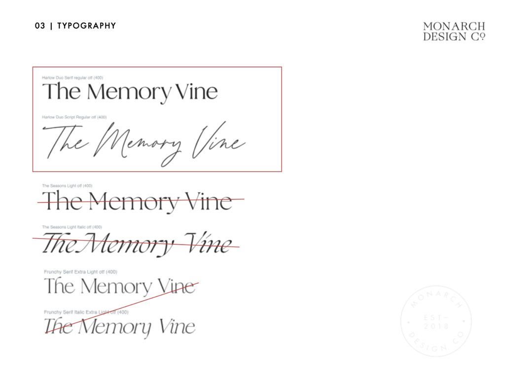
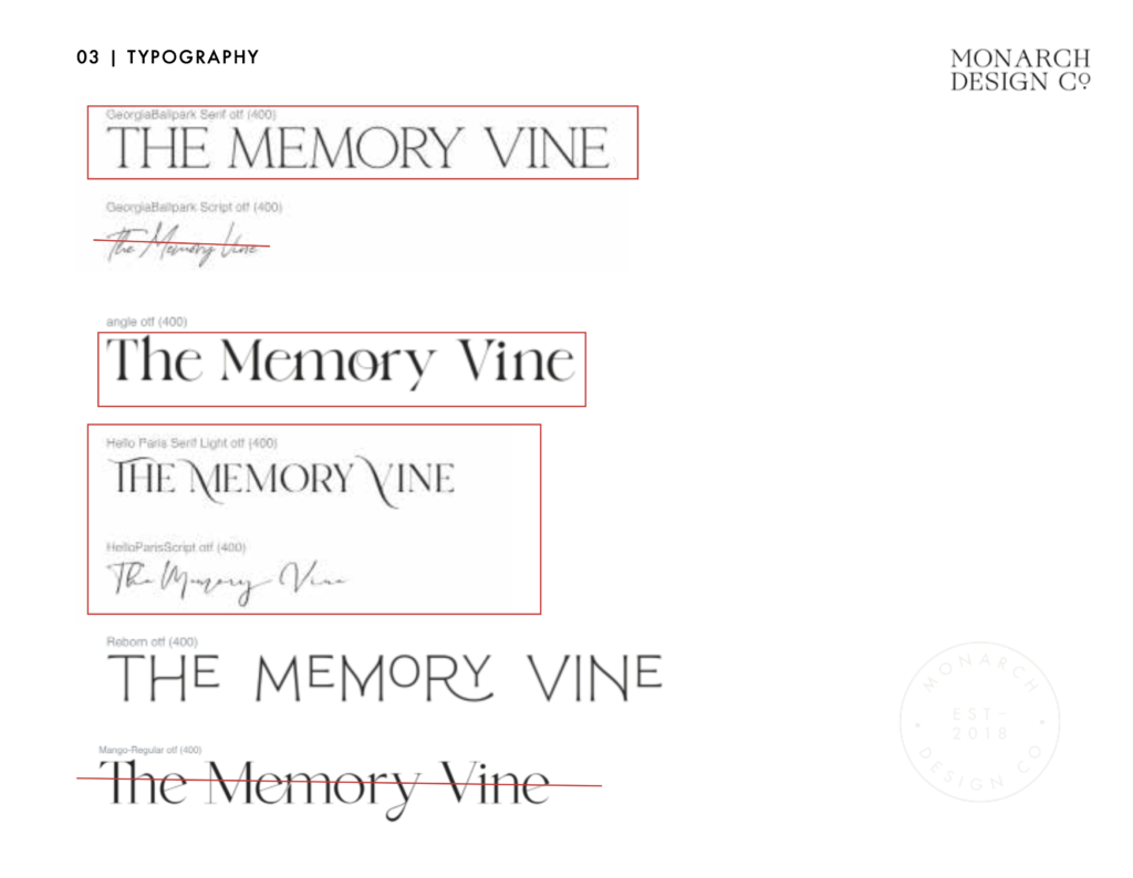
With a colour palette evoking feelings of trust, love, new beginnings and lightness, I started the search for the perfect fonts for this branding project. I am a font fanatic — each typeface expresses a different emotion, so it was important to choose a combination that not only complemented each other but told the story of Paula’s brand.
To channel a charming feel with a touch of whimsical romance, I selected a combination of a light serif typeface and modern calligraphy. Serif type carries a sense of tradition and timelessness: an heirloom-feel rooted in trust that perfectly captures The Memory Vine’s commitment to making everlasting memories.
To add a romantic feel, I combined the serif font with modern calligraphy that adds a hand-drawn, sentimental element. The hand-written nature of this script evokes a sense of elegance and emotion, which channels the intimate, personal feel to The Memory Vine’s events while complementing the timelessness of the serif font.
When it comes to your Brand Anatomy, It’s All in the Details
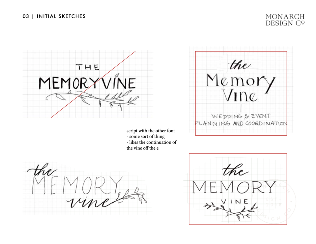
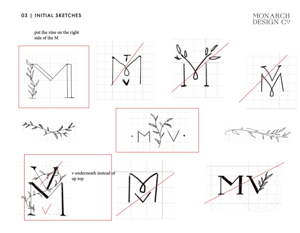
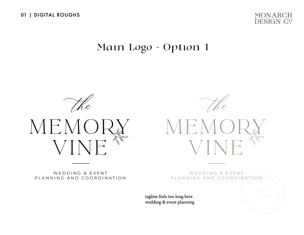
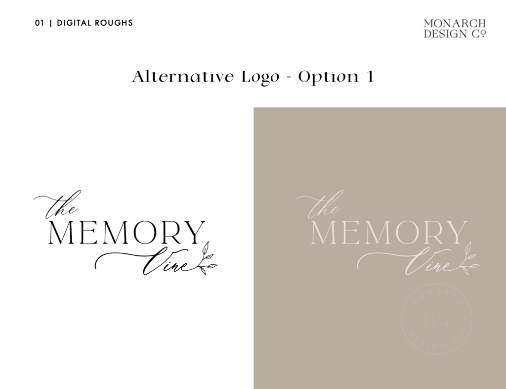
With the colour palette and typography set, it was time to add all of the little details that make the brand anatomy truly special and reflect what makes The Memory Vine unique. For a whimsical touch, I added these hand-illustrated vines that draw on the brand’s namesake. To symbolize the growth, new beginnings and elegance of Paula’s brand, these simple vines represent love in full bloom.
And They Lived Happily Ever After …
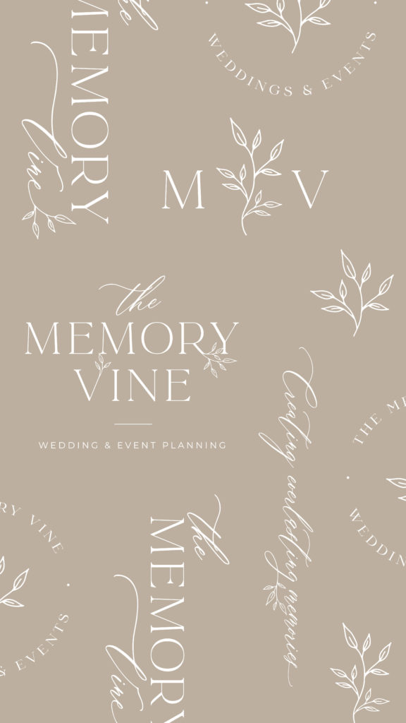

Together, this colour palette, typography and illustrated vine detail and all the anatomy that went into creating this brand, came together harmoniously to create a brand that creates a lasting impression on The Memory Vine’s dream clients by telling a compelling story. With this fully customized brand as the refreshed face of The Memory Vine, Paula is ready to continue on her path to creating everlasting memories through her wedding and event planning services. Equipped with a full branding package, Paula has all of the tools and materials she needs to create a consistent, memorable visual story that allows her to take flight 🦋
As a boutique branding studio, Monarch Design Co. is committed to helping small businesses across Southwestern Ontario like The Memory Vine take flight by creating authentic brands that reflect the heart and spirit of your biz. If you’re just starting your business or are hoping to refresh your brand as you grow and evolve, let us be your fairy godmother and bibbity bobbity boo your brand so you can shine the way you deserve ✨Your horse and carriage await here!
Want to save for later? Pin now, read later!
Leave a Reply Cancel reply
Menu
serving simcoe county, barrie, the greater toronto area & worldwide
Contact
hello@themonarchdesign.co
Branding & Showit Web Design Studio | Serving Creative Entrepreneurs, Service Providers & Wedding Professionals in Barrie, Toronto, Niagara, Muskoka, Cambridge, Kitchener, Guelph, Hamilton, Burlington, Oakville, Mississauga, Vaughan, Simcoe County & Southern Ontario.
Monarch Design Co. © 2026 | Site & Branding Designed by Monarch Design Co. | Site Credits