Behind-the-Brand: Annie Bri
August 23, 2022
Thoughtful, Timeless Wellness Blog Branding & Web Design That Mirrors the Healing Journey
As a wellness advocate passionate about healthy living, Annie Bri’s blog inspires women to reconnect with their inner goddesses. By eating a whole and nutrient-dense diet and getting serious about self-care, Annie is sharing her story as she works to heal her digestive issues, mental health and hormonal imbalances — all while encouraging women to walk the path to wellness alongside her.
While Annie helps her readers build healthy habits, she came to us to create a brand and website that reflects her journey. With a thoughtful, timeless new brand and website, we’re delving into the journey of creating this beautiful branding project!
Intentional, Timeless Wellness Blog Branding To Inspire Women to Feel Like Their Best Selves
During our deep dive into the heart and soul of her blog, Annie expressed that she wanted a brand that was comforting and feminine. Beginning with a soft, earthy and feminine feel, we went to work creating a brand that felt intentional and representative of the healing journey.
A Comforting Colour Palette Inspired by What Makes You Unique
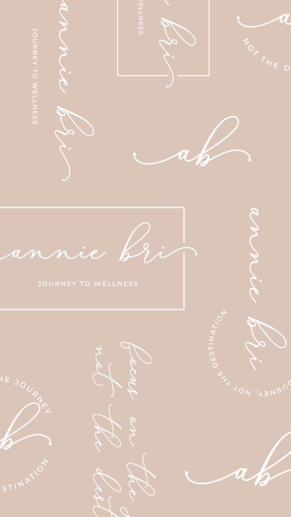
Annie’s wellness blog branding is all about reconnecting you to best version of yourself, both mentally and physically. That’s why when we began crafting her colour palette, our intention was to create a comforting, feminine and unique feel.
Annie’s colour palette consists of earthy greens, dusty rose, a soft peony pink and creamy whites. Firstly, we began with a beautiful dusty rose and soft peony. Above all, the pink hues in Annie’s colour palette represent femininity, kindness, warmth, gentleness and calm. Because her brand focuses on creating a safe space for women to navigate their wellness journey, gentle pinks were a staple to this palette!
To ground the pink hues, we paired them with shades of green that represent nature, growth, harmony and balance. As a blog focused on mindful living, bringing in earthy greens was the perfect way to communicate what she creates! After that, we brought in creamy whites that convey clarity, peace and hope — all beautiful embodiments of mindfulness.
Together, these hues work harmoniously to represent healing, balance, mindfulness and warmth while channelling Annie’s approachable, grounded and warm brand personality. As one of the first things people notice about your brand, building a colour palette that tells your story is key!
Thoughtful Typography: The Details That Bring This Wellness Blog’s Branding to Life
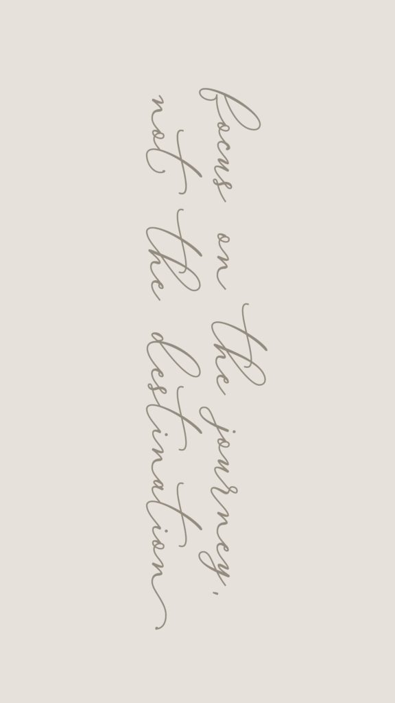
Annie was drawn to cursive, so when we were choosing her brand fonts, we fell in love with this script reminiscent of hand-lettering. In the world of font psychology, every font evokes a different feeling. With its hand-written nature, this script font represents femininity, elegance, creativity and thoughtfulness — which are all important values to Annie and a key component of her brand personality!
To add a sense of balance to Annie’s typographic hierarchy, we paired this beautiful calligraphy with clean, modern sans serifs. Along with providing a foundation for her script to shine, sans serifs communicate an open, friendly feel that represents Annie’s warm nature!
A Website That Helps Visitors Walk the Path to Wellness
Before you begin, think about the goals you have for your website: is it for visitors to read your blog? Encourage more partnerships and sponsorships? Engage with your visitors? Encourage bookings? Inquire about your packages? Subscribe to your newsletter? Purchase a product you offer? Reflecting on the goals you have for your website helps you create a clear, engaging user experience that encourages visitors to explore your site. For Annie, her goals for her website were to:
- Encourage visitors to read her blog posts, ranging from healthy, delicious recipes to mindful living tips and more.
- Encourage visitors to listen to her podcast, Power to Thrive
- Cultivate partnerships and sponsorships with brands offering products, services and resources that help people navigate their health and wellness journey
With these goals in mind, we began designing a high-converting website that encourages her visitors to engage with her content! For all of our web design projects, we use Showit because it is super customizable and allows us to build a truly unique website. If you love Annie’s website and want to build a Showit website of your own, check out our drag-and-drop Showit website templates or book your free discovery call with us!
To align with her goals for her website, here is the breakdown of Annie’s beautiful blog design.
Breezy Branded Images That Make All the Difference
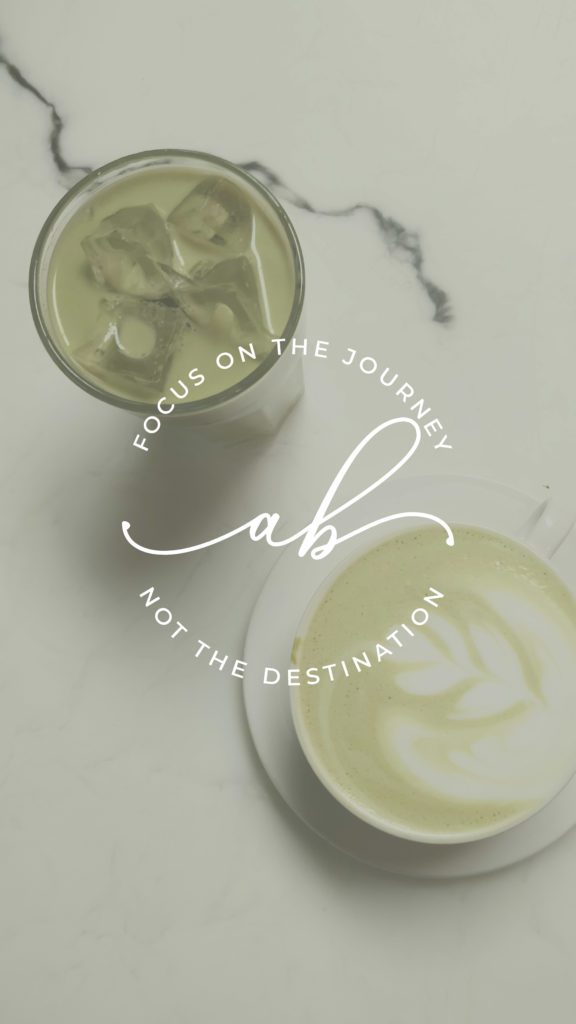
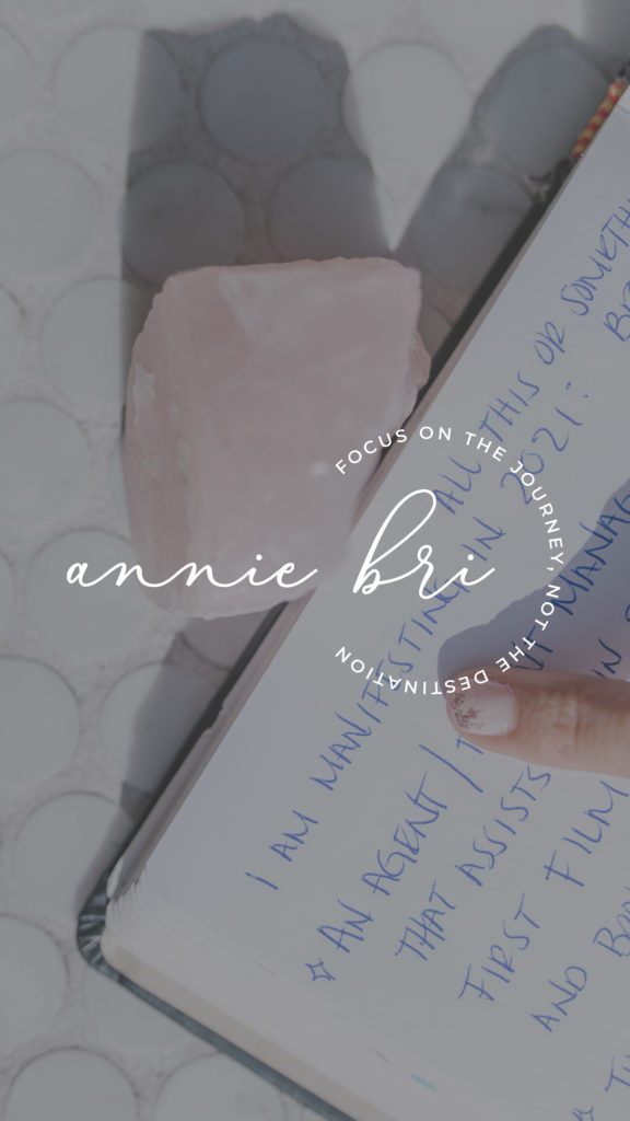
We can’t even begin talking about Annie’s blog without acknowledging the incredible difference these visuals by Megan Butchard Photography make! Branded images that align with your personality and branding are a key component to an engaging site. Annie’s blog incorporates beautiful images that guide the eye through her website, all while making it feel modern and unique.
Building an Editorial-Inspired Blog that Helps Readers Find the Power to Thrive
Website designs differ based on the type and nature of your biz. Depending on if you’re a service-based biz, product-focused or a blog, we build your site to suit your specific goals and needs so your website serves you the best it possibly can! Since Annie is focused on growing her blog, her website was designed with an editorial feel to highlight her posts.
To create a space for her content to shine and help her readers walk their path to wellness, we:
- Established clear categories to organize her content
- Included relevant tags to create an index for her readers and improve her SEO
- Made her posts shareable (and Pin-able!) on social media to encourage engagement
The Best Part of the Journey is the Community You Find Along the Way
Above all, Annie’s goal is to cultivate meaningful connections and inspire her readers’ path to physical and mental wellness. As a result, community-focused elements were key in her website design!
Firstly, we created a place to encourage partnerships and sponsorships to help Annie grow her blog and support her readers on their wellness journey with helpful products, services, ingredients and resources.
Additionally, we always recommend integrating a newsletter signup into your site to build your email list. Email marketing is a super effective way of building a tight-knit community around what you do. To encourage readers to sign up for Annie’s newsletter, we embedded a signup with an incentive — a free gut health checklist — to grow her community!
If you’re inspired by this wellness blog branding and web design, Monarch Design Co. is a boutique branding studio dedicated to helping small businesses and creative entrepreneurs soar. Our team of ambitious, creative women creates beautiful, high-converting brands and websites that tell your story and help you grow. Ready to refresh your brand and/or create a website that takes your small business to new heights? Book your free discovery call with us here!
Leave a Reply Cancel reply
Menu
serving simcoe county, barrie, the greater toronto area & worldwide
Contact
hello@themonarchdesign.co
Branding & Showit Web Design Studio | Serving Creative Entrepreneurs, Service Providers & Wedding Professionals in Barrie, Toronto, Niagara, Muskoka, Cambridge, Kitchener, Guelph, Hamilton, Burlington, Oakville, Mississauga, Vaughan, Simcoe County & Southern Ontario.
Monarch Design Co. © 2026 | Site & Branding Designed by Monarch Design Co. | Site Credits